Work
Fresh Approach to a Dated Sports Analytics Tool
Overview
Reimagining a legacy sports analytics platform to support modern workflows and drive analyst efficiency, with a focus on improving the Reports feature (annotation & export).
Client
StatsBomb (now, HUDL)
My Role
Senior Product Designer | UI Specialist
Tools
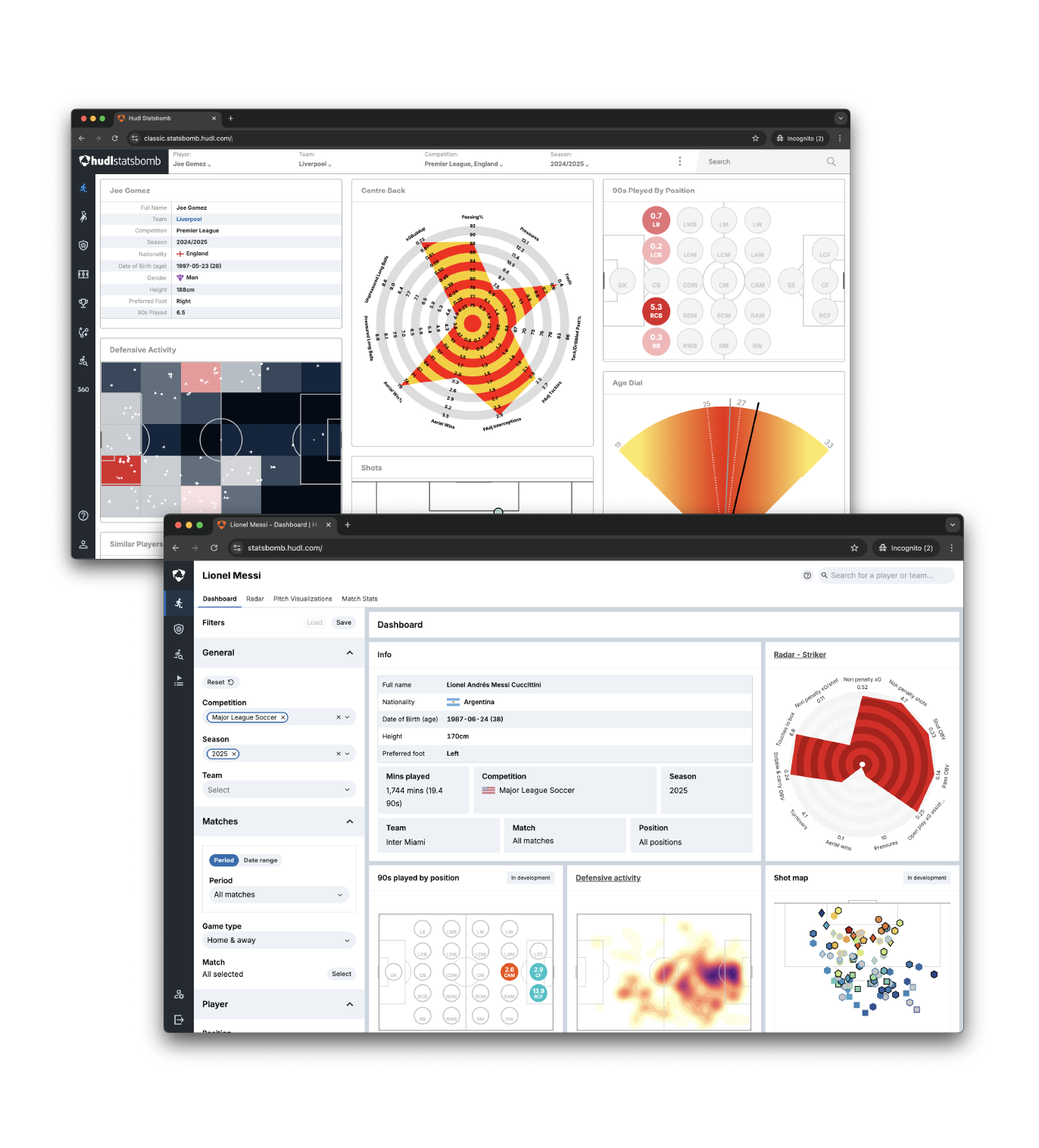
1. The Problem
Background / Context
StatsBomb IQ is the company’s flagship analytics product used by football clubs around the world. Built 7 years ago, it was written in a now-outdated tech stack that was limiting both engineering scalability and user experience enhancements.
Pain Points
- Inability to internationalise content (no translation support)
- Users could not personalise exports or save annotations
- Engineering couldn’t deliver requested UX improvements quickly
- Analysts were forced into workarounds (e.g., manual reports in PowerPoint)
Scope of this Case Study
This case study focuses on the Reports/Notes feature: a crucial component where users annotate visual data for team reporting. Improving this was a low-lift, high-impact change within a broader platform redesign.
Design Goals
- Help analysts quickly export and annotate visual insights
- Integrate note-taking into the platform flow
- Align with brand new design system
- Improve adoption and reduce reliance on external tools (e.g., Google Docs)
2. The Process
1. User Discovery
- Interviewed internal subject matter experts (former analysts, sales)
- Analysed seasonal workflows
- Identified that note-taking was part of nearly every image export
2. Benchmarking
- Audited competitor products in adjacent sports verticals
- Noted common patterns around exports, overlays, and inline comments
3. Mapping User Journeys
- Created user journeys for key personas
- Highlighted the moment note-taking naturally occurred in the report creation process
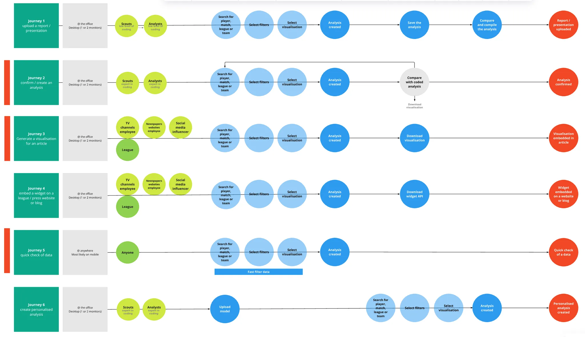
User journey showing pain point where annotations are needed post-export
4. Low-Fidelity Wireframes
- Sketched note functionality embedded in tiles and overlays
- Presented to PMs and SMEs to validate approach
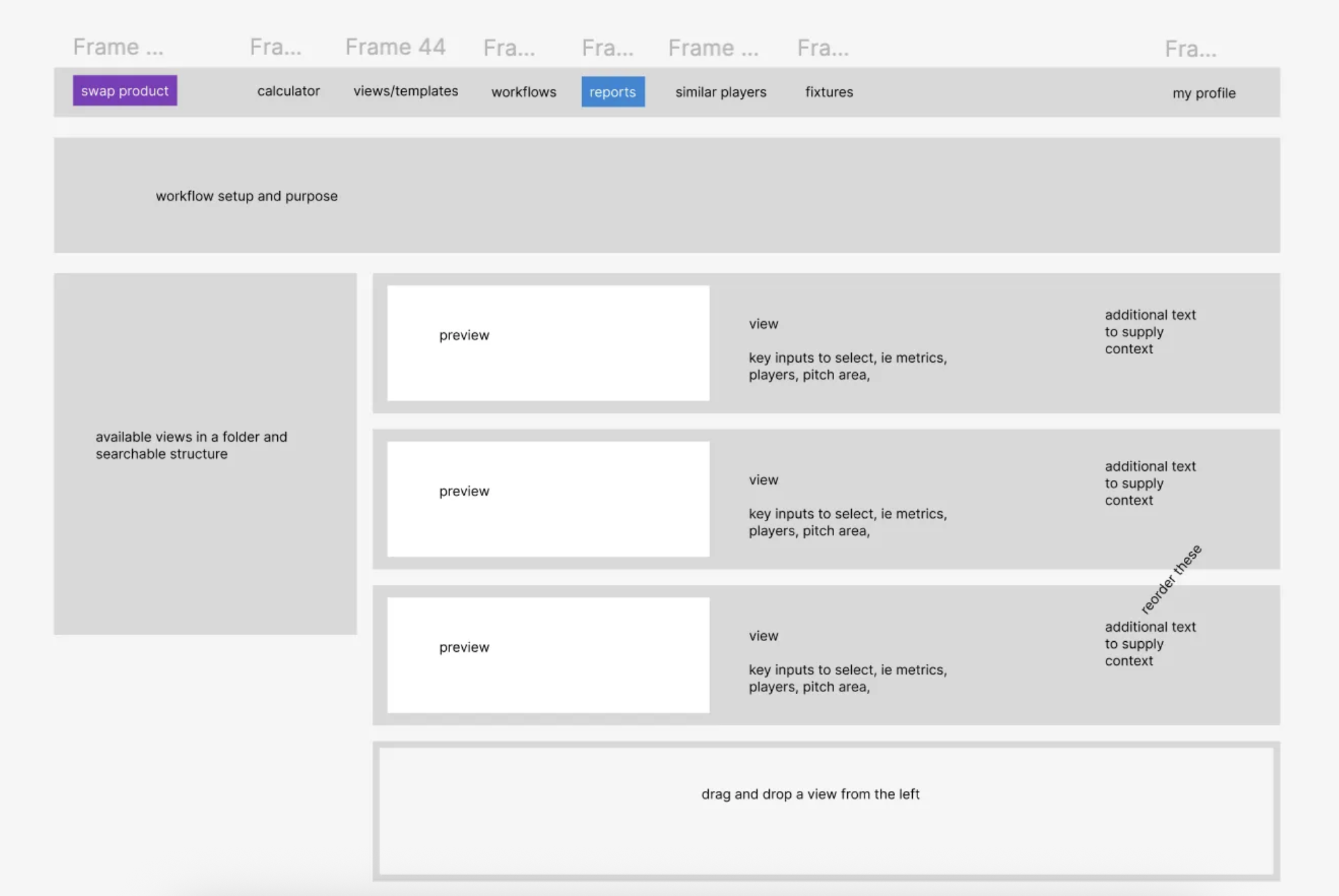
Initial concepts for inline note input fields
5. High-Fidelity Mockups
- Used the new design system to ensure visual consistency
- Added inline notes panel with persistent visibility
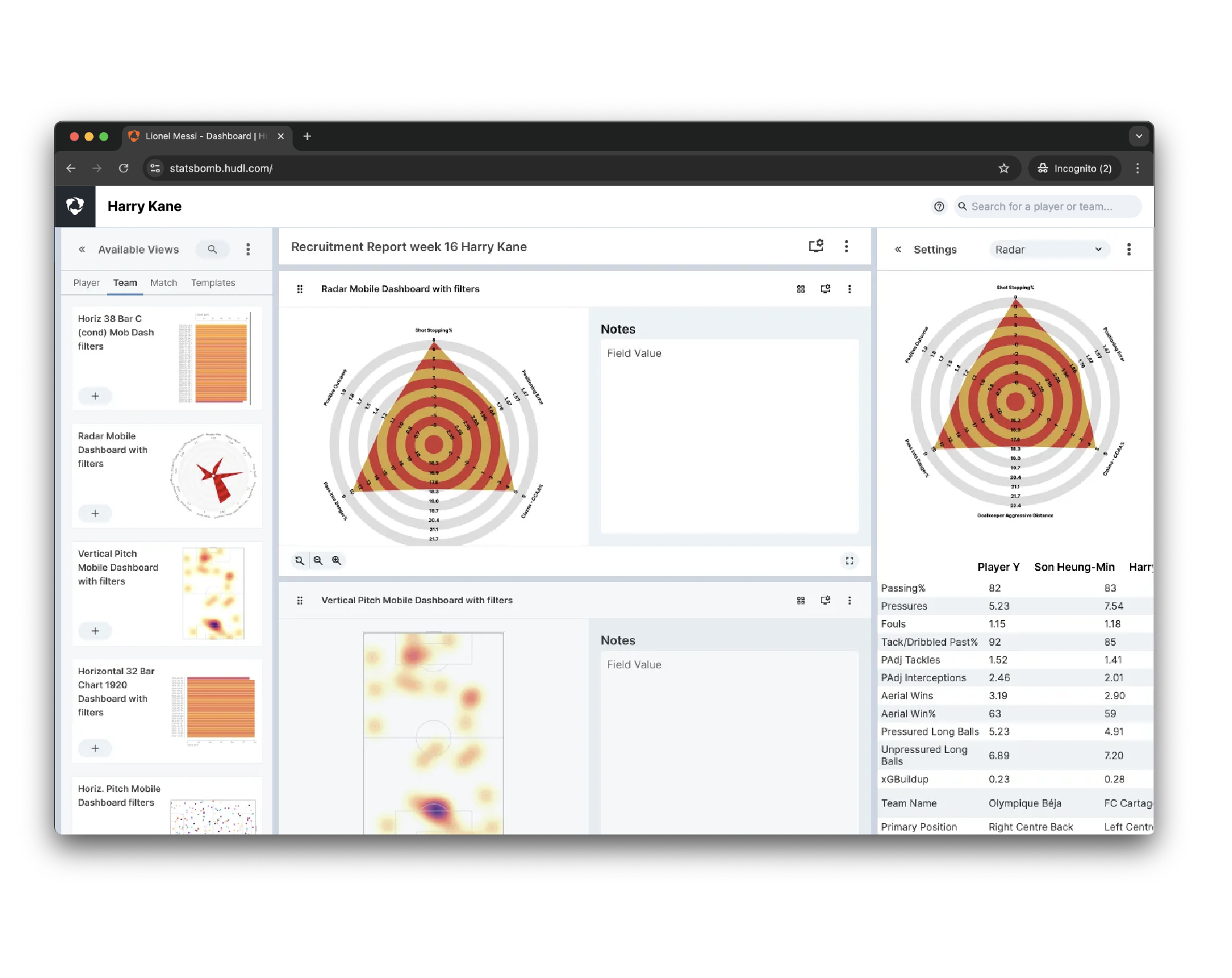
Final design of note input next to a visualisation tile
Challenges & Solutions
Challenge: Internal resistance to prioritising “just notes”
Solution: Framed as a productivity unlock tied to export goals & report velocity
Challenge: Where to place the notes UI for least disruption
Solution: Tested three placements; chose a sticky sidebar with autosave
3. The Outcome
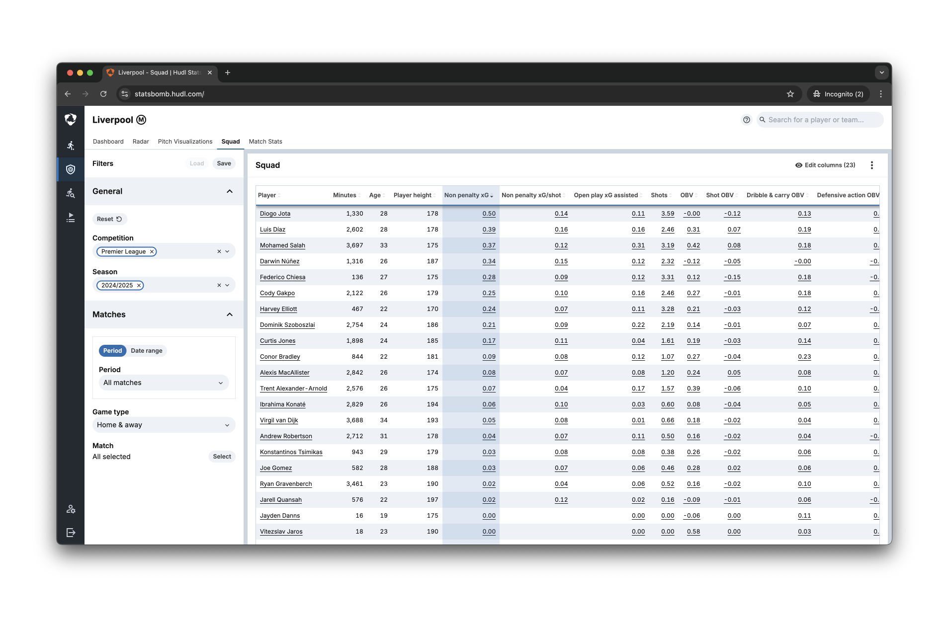
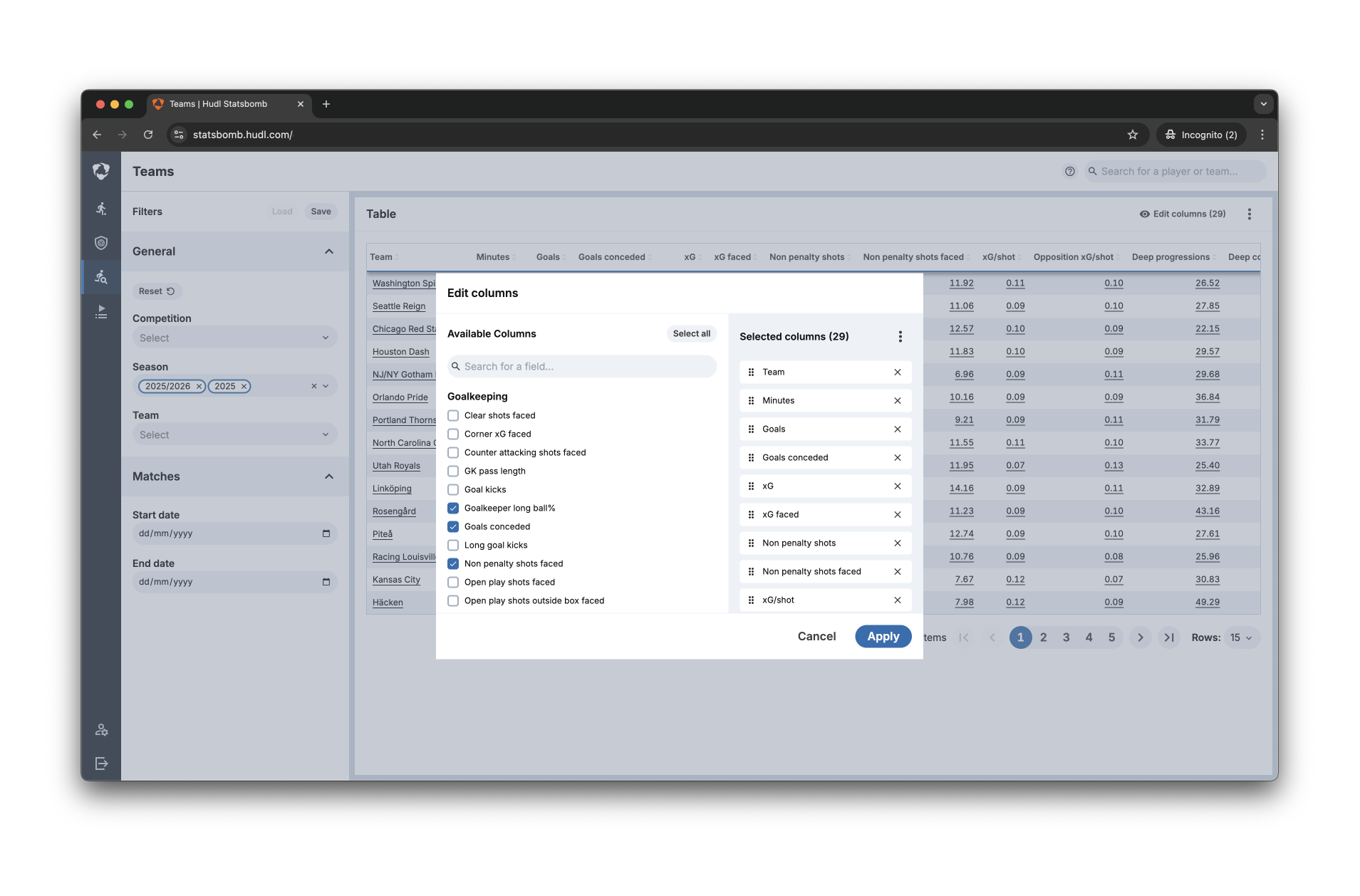
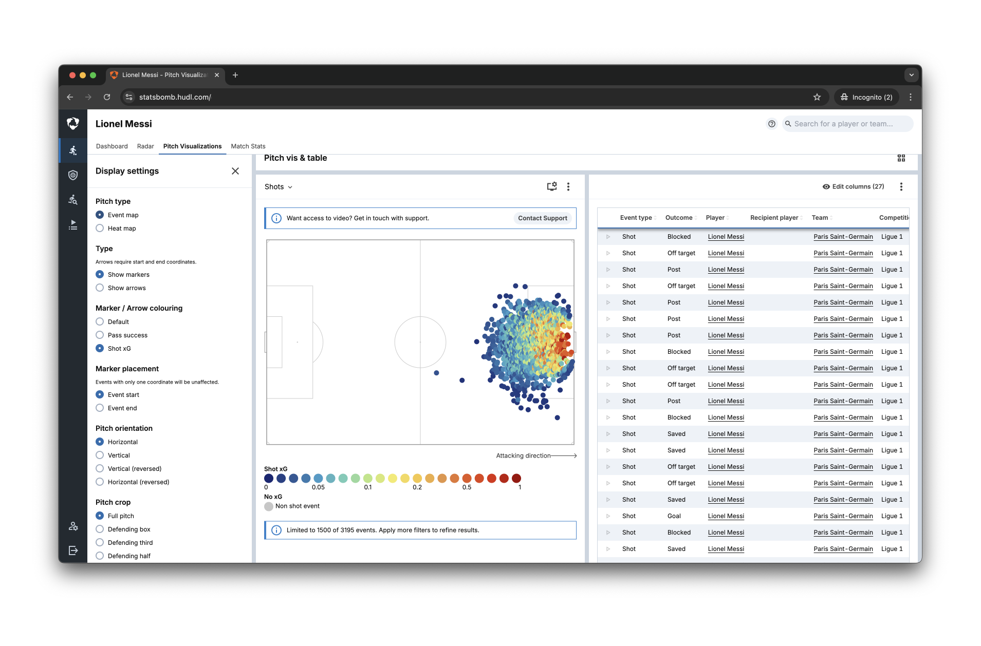
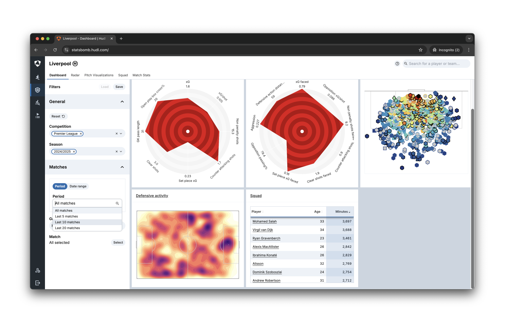
The redesigned Reports/Notes feature, as of Q1 2025 is still in development. The new flow integrates note creation, saves it to each visual tile, and enables PDF-ready exports.
As the feature isn’t yet available, here are a few screenshots of the improved UI of the new tool
“Whenever an analyst is downloading an image from IQ… they add annotations. This update will change the speed we can generate reports.”
Lessons Learned
- Smaller scoped UX improvements can drive high adoption if rooted in real workflows
- Framing improvements around business KPIs (e.g., export efficiency) builds buy-in
- Testing with internal SMEs helped unlock priorities faster than waiting on external clients
Measurable Impact
-
Notes adoption estimated at 90% based on SME testing
-
Time to create annotated reports reduced from ~45 mins to under 20 mins
-
Improved analyst satisfaction & reduced reliance on external documentation tools
