Work
Kitbag: A Unified Design System for StatsBomb’s Expanding Product Suite
Overview
A complete redesign initiative to unify 12+ digital products under a single design system, improve developer efficiency, elevate brand trust, and reduce user friction, all during a period of explosive growth.
Client
StatsBomb (now, HUDL)
My Role
Senior Product Designer | UI Specialist
Tools
Figma, Notion, Storybook, Miro, Heap
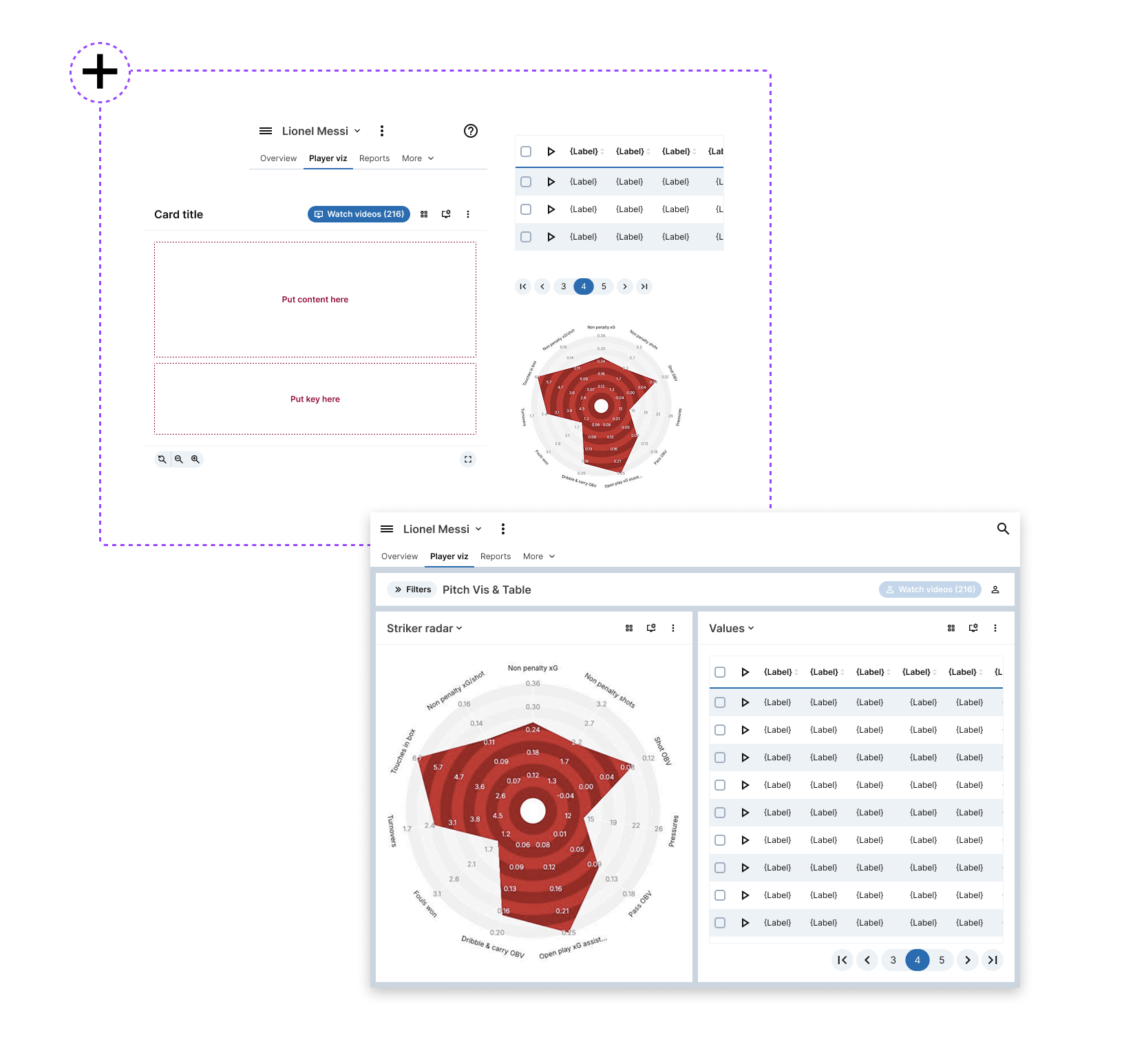
1. The Problem
Background
StatsBomb is a sports data analytics company serving elite soccer and American football organisations. In 2021, the business was growing fast — onboarding new hires weekly and rolling out new tools at pace.
At the time, over a dozen web-based products were in use. Each had been built independently with their own styles, components, and interaction patterns. Internally, this created inconsistency and maintenance complexity. Externally, it eroded brand trust and created friction for customers moving between tools.
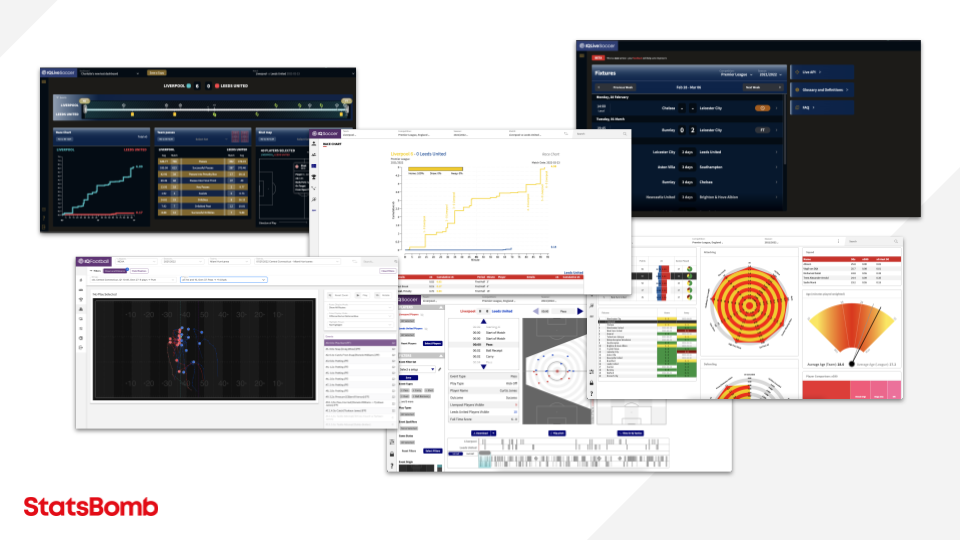
Before Kitbag: Each product had its own visual language — light and dark modes, flat and gradient styles, and clashing colours. This fragmented experience confused users and slowed development.
Pain Points
- Design team had to maintain 12+ separate UI systems.
- Engineers required extra onboarding time for each product.
- UI inconsistencies confused users and affected accessibility.
- Marketing had limited influence over in-product brand perception.
- No scalable system to support future product launches.
Design Goals
- Unify visual and UX patterns across all products
- Reduce developer/design duplication
- Ensure brand consistency and accessibility
- Support multiple themes (light/dark) with minimal overhead
- Build a system that scales for future growth and acquisitions
2. The Process
1. Research & Alignment
- Interviewed stakeholders across product, engineering, marketing
- Audited all existing tools — identified redundant patterns and mismatched styles
- Reviewed competitors and adjacent tools for layout patterns and UX standards
- Worked with marketing to translate brand values into product values and a moodboard
- Ran a workshop on layout systems — explored how best to present dense sports data
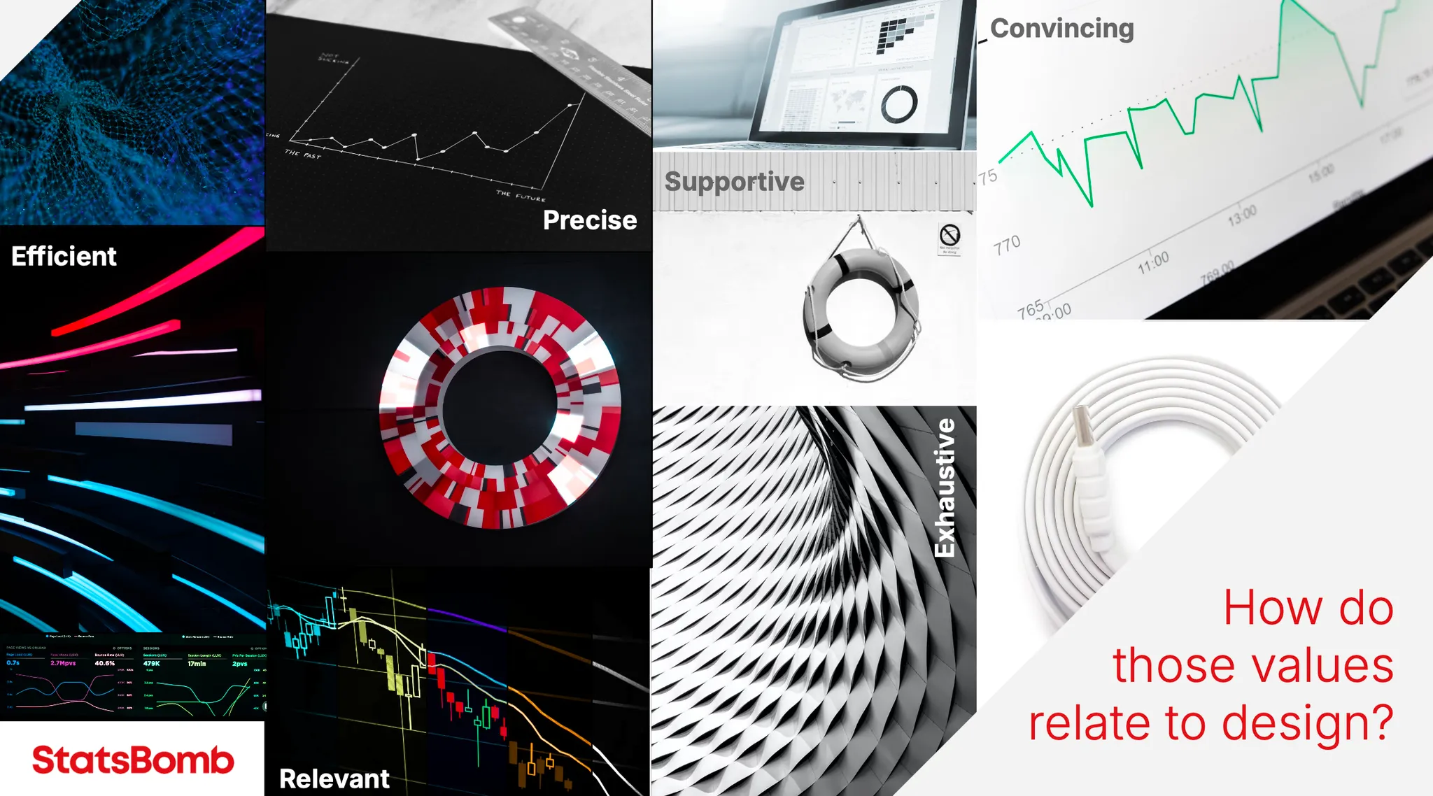
Translating Brand to Product: I worked with marketing to convert abstract brand values into tangible UI principles. This moodboard helped align product, design, and marketing around a shared vision.
2. System Architecture & Theme Development
- Defined foundational tokens: colour, typography, spacing, icons, opacity
- Designed light/dark mode to swap using a single token set (no duplicate components)
- Created a scalable colour token system with 4 states:
main,strong,weak,inkfor WCAG AA compliance - Documented every token with usage guidance directly in Figma and Storybook
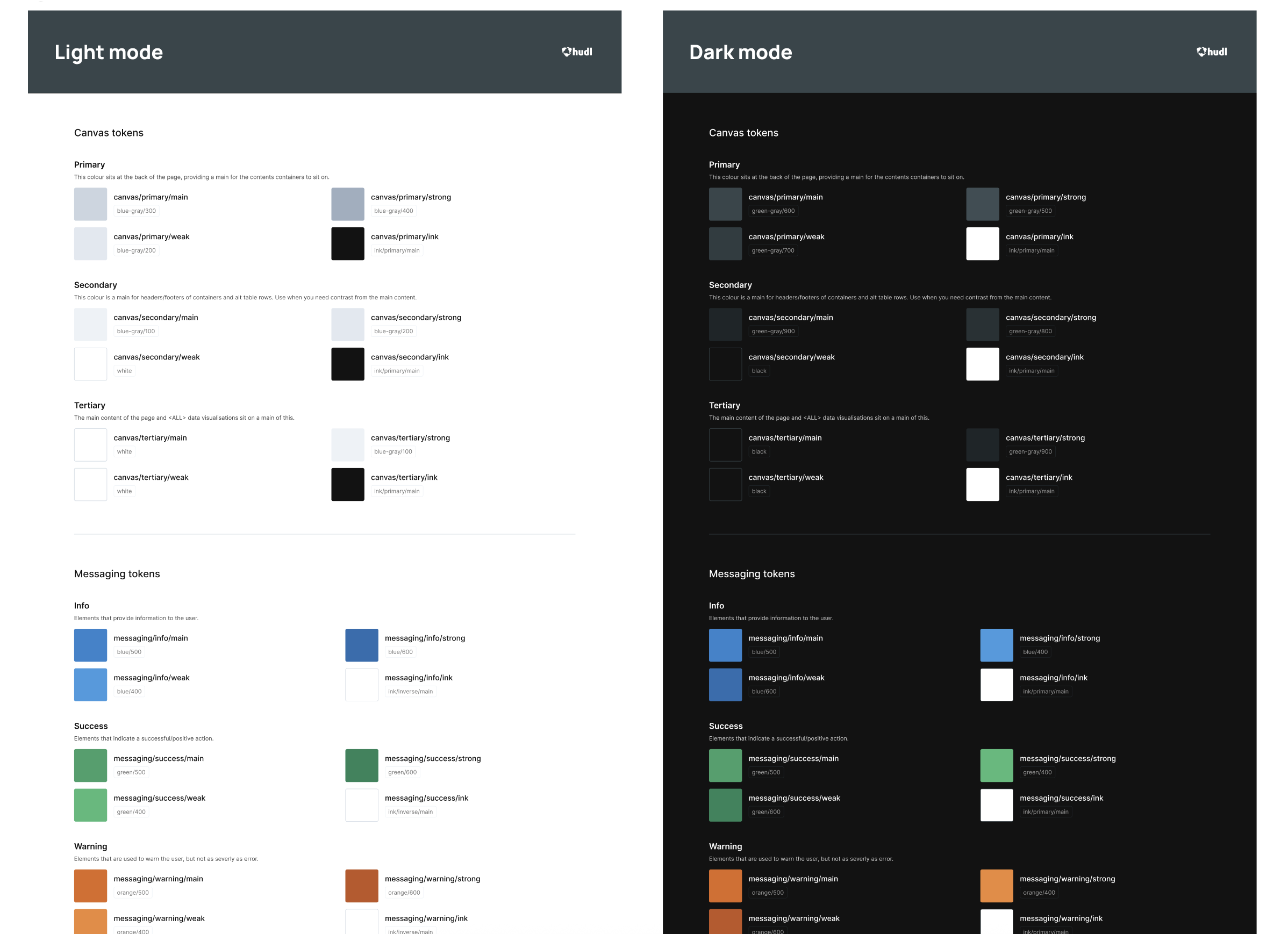
Accessible Colour Tokens: Every colour in Kitbag was defined in four states to support contrast and interaction clarity across themes — meeting WCAG AA accessibility by design.
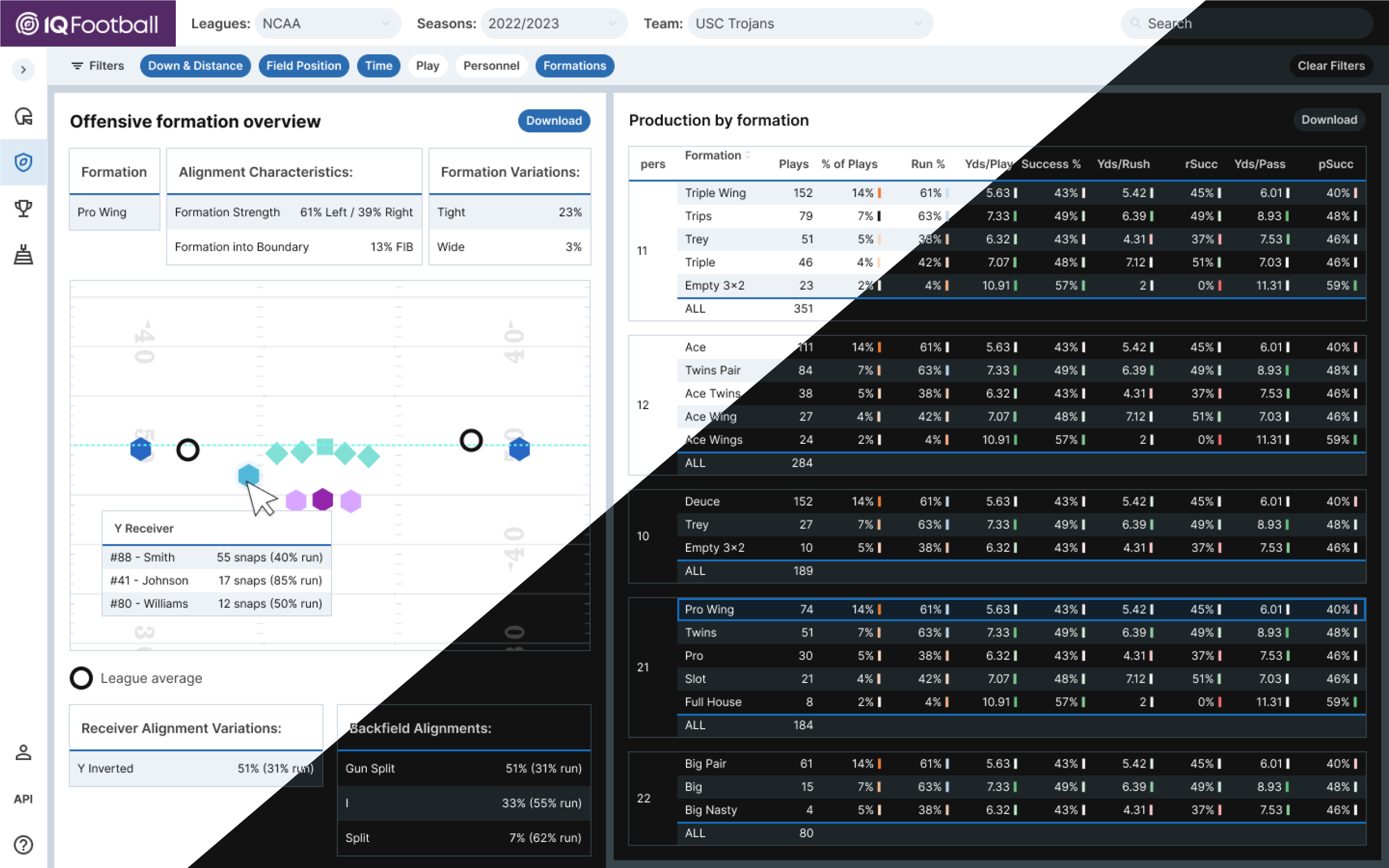
One System, Two Themes: With a single shared token set, Kitbag supports both light and dark modes without doubling engineering effort — improving accessibility and user preference.
3. UX Patterns & Component Design
- Identified two dominant layout types:
- “Waffle”: modular, card-based layouts with distinct sections
- “Pancake”: flat, continuous interfaces for complex control task
- Built low-fi wireframes of each type to validate layout flexibility
- Designed atomic components (e.g., buttons, inputs, pagination) in collaboration with engineers
- Developed icon library with usage rules to enable future contribution
- Developed a cohiesive set of accessible Data Visualisation Palettes for use across the products and Marketing
Custom Icon Set: I curated and documented a 200+ icon set for sports-specific use cases, enabling scalable growth and contribution across teams.
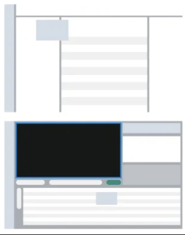
Defining Layout Patterns: I identified two recurring layout types — “Waffle” for modular dashboards, and “Pancake” for dense task flows. These patterns informed component architecture and design rules.
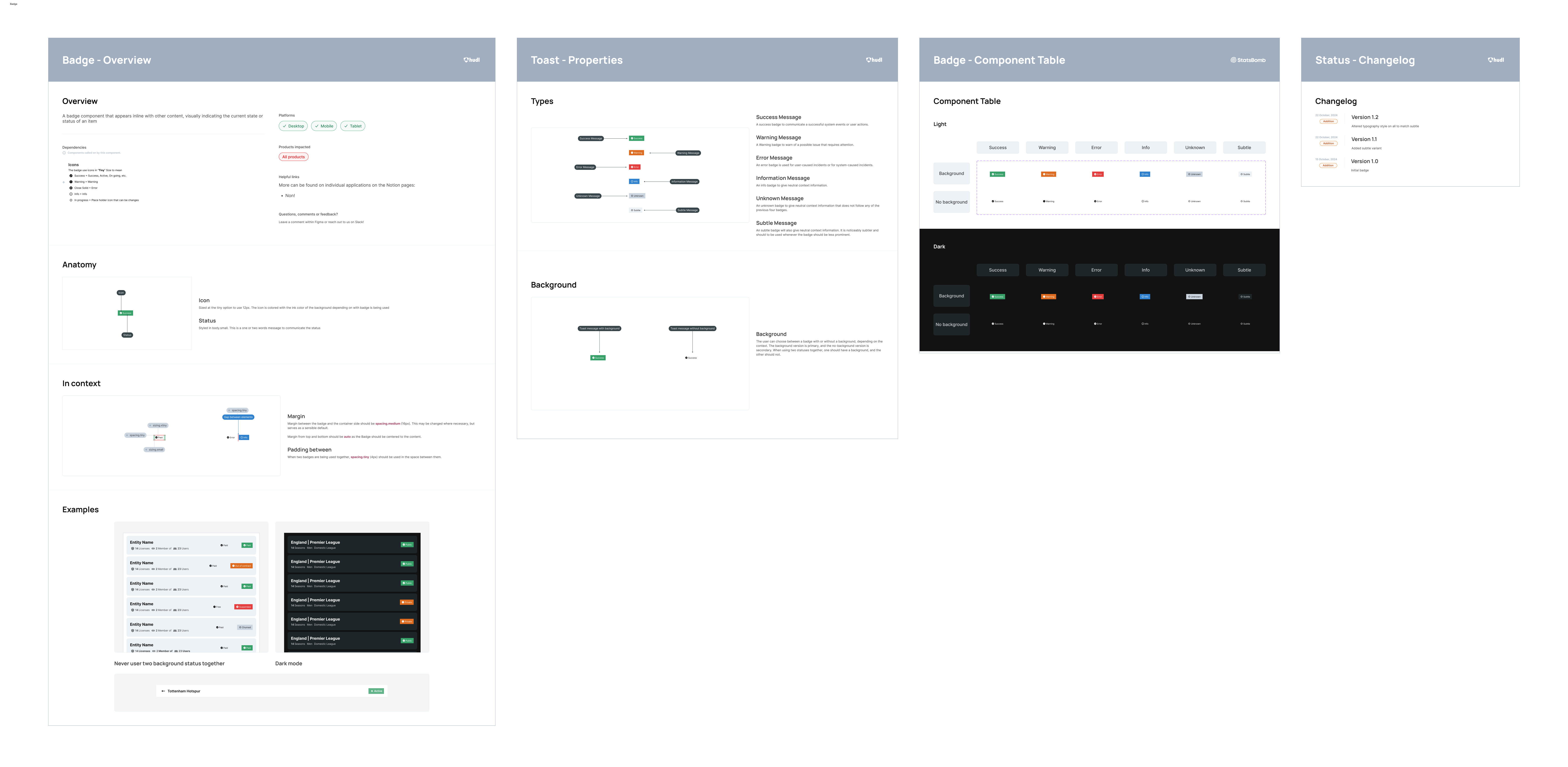
Atomic Components, Documented for Scale: Components were designed with reuse and accessibility in mind, each backed by guidance in both Figma and Storybook for seamless adoption.
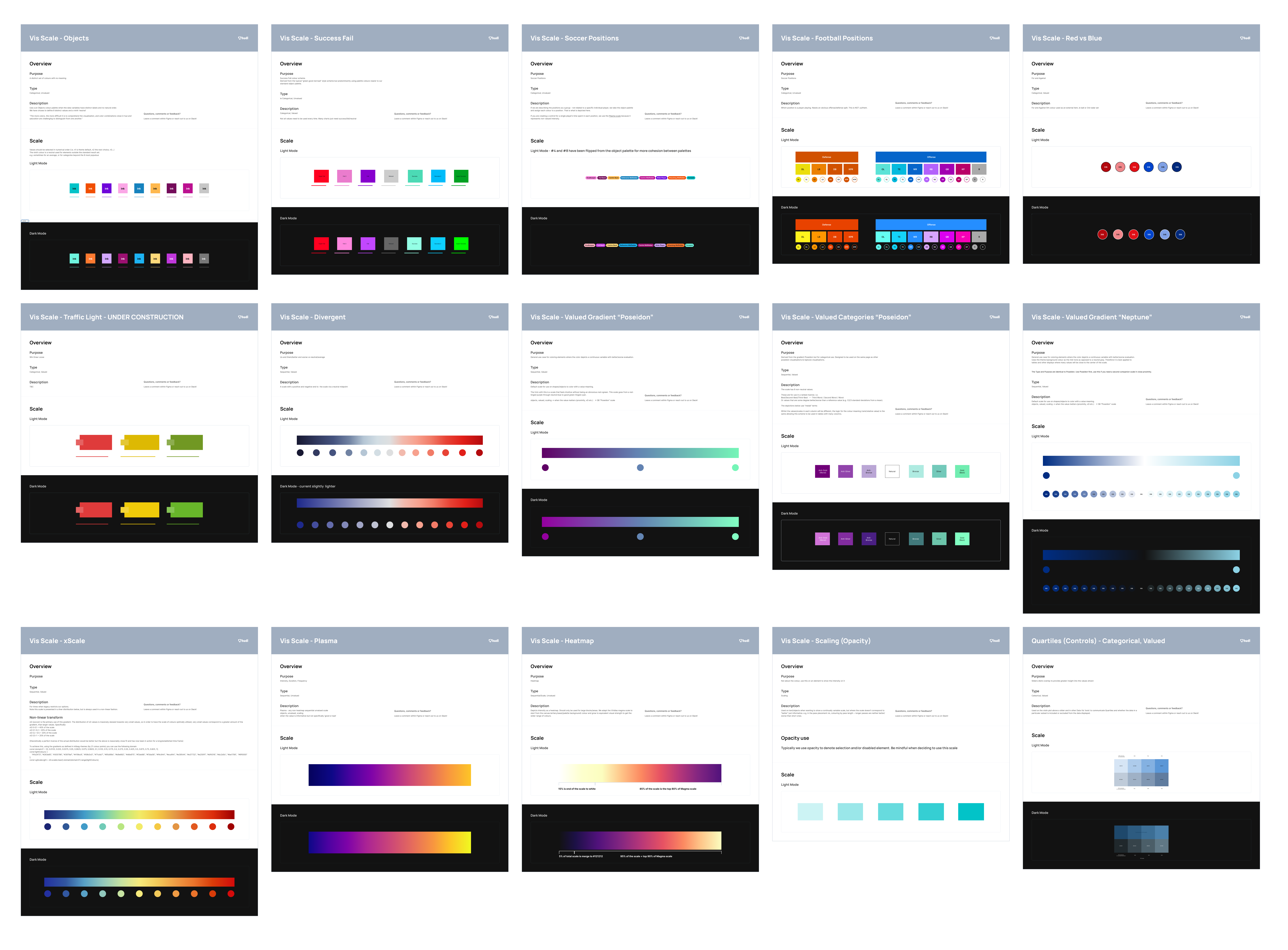
Visualisation Palettes: I co-led the creation of a discrete, scalable palette system to unify data visuals, enabling clarity, consistency, and future branding customisation.
4. Rollout & Internal Collaboration
- Conducted weekly feedback sessions with designers across the business
- Aligned all teams to a shared Figma library and design language
- Paired with engineers to ensure implementation parity in Storybook
- Created shared Notion docs to record patterns and decision history
Challenge |
Solution |
| Dual theme support risked doubling code | Built a token system to switch themes without needing two sets of components |
| Inconsistent adoption by designers | Held weekly check-ins, created annotated examples, coached teams on usage |
| Visual style clashed with new brand identity | Worked closely with marketing to tone down UI and elevate data visuals |
| Concerns about accessibility standards | Created token contrast matrix to meet WCAG AA across all components |
3. The Outcome
Kitbag’s dark and light mode is now used across every product at StatsBomb, including:
- IQ Soccer
- IQ Football
- Video Tool
- Licensing Tool
- Tracking Data Collection Tool
- and more
All interfaces now feel cohesive, performant, and on-brand — even as new tools are launched and old ones evolve.
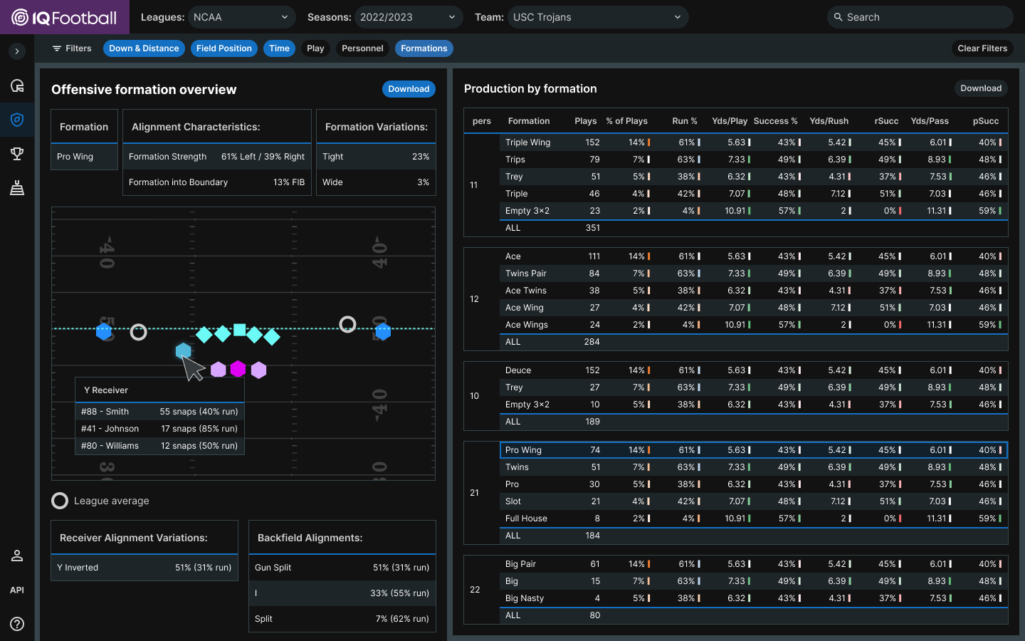
IQ Football (Dark Mode): Kitbag’s theme system supports full parity in dark mode, consistent layout, token behaviour, and accessibility throughout.
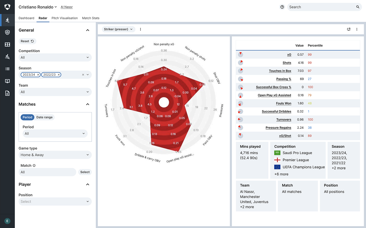
IQ Soccer (Light Mode): Kitbag brings clarity to dense data views by toning down the interface and dialing up the data. Clean visuals, high contrast, and smooth UX.
3. The Outcome
To measure Kitbag’s impact, I planned and ran an internal survey across design, engineering, and product teams. The responses highlighted real time savings, consistency wins, and areas to improve—many of which fed directly into our backlog.
“I gain 6–8 hours back every fortnight from not reinventing design patterns.”
– Jim, UX/UI Designer
“We trust the components are accessible and consistent. That speeds up our build process.”
– Jordan, Frontend Engineer
“I don’t need to write detailed specs for common components anymore. It just works.”
– Shane, Product Manager
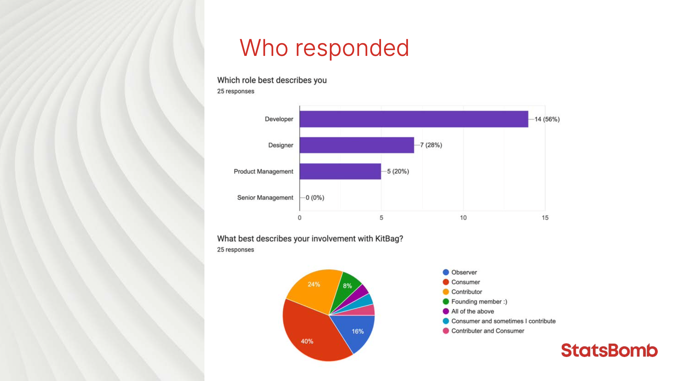
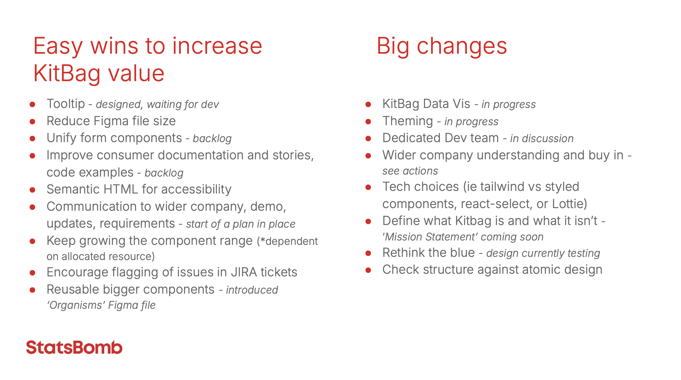
Real Feedback, Real Impact: We surveyed internal users one year post-launch — findings guided backlog priorities and confirmed the system’s time-saving and consistency value.
Lessons Learned
- Design systems must be usable, not just beautiful
- Collaboration beats perfection, aligning cross-functionally saved time and improved quality
- Simplicity in token design prevents long-term complexity
- Continuous feedback → adoption → trust
Measurable Impact
- 30% faster product build times for new tools
- Saved 400+ hours per quarter across design & engineering
- Created a single source of truth for UX/UI across 12+ apps
- Helped establish brand trust leading to Hudl’s acquisition of StatsBomb in 2024
